
- Видео 45
- Просмотров 1 657 228
StyleMyPic
Добавлен 26 апр 2012
With the StyleMyPic Channel, our goal is to provide professional and innovative Photoshop retouching techniques in easy to follow instructions.
While some of the retouching tutorials are created using StyleMyPic products in Photoshop, most of the techniques can be applied using standard Photoshop tools and methods.
StyleMyPic
Portrait | Fashion | Beauty Retouching Tools
🎥 Tutorials: ruclips.net/user/stylemypic
✍🏼Retouching: retouch@stylemypic.com
🎨 Photoshop Panels/ 3D LUTS
1-Click Photoshop COMPOSITE in LESS than a Minute!
Check out the Post Pro panel here: www.postprotools.com/
See the full Video series here: ruclips.net/video/ot9sFa2de-M/видео.html
See the full Video series here: ruclips.net/video/ot9sFa2de-M/видео.html
Просмотров: 375
Видео


FINALLY! AI Masks in PHOTOSHOP from Lightroom.
Просмотров 5092 месяца назад
Check out the Post Pro panel here: www.postprotools.com/ See the full Video series here: ruclips.net/video/ot9sFa2de-M/видео.html

NEW! Portrait Headshot & Beauty Retouching in 4 Steps - Photoshop Tutorial with Post Pro plugin.
Просмотров 1,1 тыс.3 месяца назад
Check out the new Photoshop plugin at www.postprotools.com/ See the full Video series on the Post Pro channel: ruclips.net/video/ot9sFa2de-M/видео.html
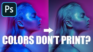
STOP trying to 'Fix' Gamut Warning! Do THIS instead in Photoshop.
Просмотров 81 тыс.4 года назад
Get the Best possible Colors in Print & DON’T let the old Gamut Warning Affect you. Soft Proofing SIMPLIFIED in this Photoshop Tutorial. 📸 Start Retouching 10x FASTER with Post Pro Photoshop Panel: www.postprotools.com/ △ LINKS: Color Spaces (sRGB/AdobeRGB/ProPhoto RGB) Video: ruclips.net/video/ujE5bBXIKJE/видео.html Color Profiles (Assign Profile vs Convert to Profile) Video: ruclips.net/video...

Master PEN Tool Selections, Layer & Vector MASK in Photoshop | Full TUTORIAL
Просмотров 11 тыс.4 года назад
Learn how to use the RIGHT selection tool for a particular task. Complete Crash Course in creating Photoshop selections with Pen Tool, Smart Selection Tools, Layer and Vector Masks. 📸 Start Retouching 10x FASTER with Post Pro Photoshop Panel: www.postprotools.com/ ⏰ TIME STAMPS: ► Skip to ANY section... 0:26 Importance of Manual Selections 1:08 Polygon Lasso vs Pen Tool 1:57 Why I switched to t...

Insane 'Select Subject' Update- Cut Out HAIR from ANY Background + Select & Mask Photoshop Tutorial
Просмотров 6 тыс.4 года назад
New June 2020 Photoshop Update has done MAGIC with Select Subject especially for Hair Selections. Learn how to select and refine Hair mask with Select Subject and Select & Mask in this Photoshop Crash Course. 📸 Start Retouching 10x FASTER with Post Pro Photoshop Panel: www.postprotools.com/ △ LINKS: Luminosity Masking Video: ruclips.net/video/TAqZ4y3RnYE/видео.html Remember: Subscribe Like Shar...

ULTIMATE Noise Reduction Technique + FREE Photoshop Action!
Просмотров 8 тыс.4 года назад
The best possible technique to remove noise from any image gift wrapped for you in the form of a Photoshop Action that works on 8 and 16bit images. 📸 Start Retouching 10x FASTER with Post Pro Photoshop Panel: www.postprotools.com/ △ LINKS: DeNoise Video: ruclips.net/video/cR8kS8LOWGQ/видео.html PS Action: Discontinued since 2024 Remember: Subscribe Like Share= New Tutorials! #PhotoshopTutorial#...

Clean Seamless Backdrops EASILY in Photoshop (2 Effective Techniques!)
Просмотров 29 тыс.4 года назад
Save Yourself Hours by using the Most Effective Method to Clean Dirty Backgrounds In Photoshop. 2 Separate Techniques for Light and Dark Seamless Paper Backdrops Explained! 📸 Start Retouching 10x FASTER with Post Pro Photoshop Panel: www.postprotools.com/ △ LINKS: Frequency Separation 3.0 & 5.0 Free Actions: ruclips.net/video/jPWOpA0T99I/видео.html Master Curves Video: ruclips.net/video/jVSvskh...

Realistically Remove Lens Flare in Just 2 SIMPLE Steps in Photoshop + Free PSD File
Просмотров 9 тыс.4 года назад
Follow these 2 SIMPLE Steps to remove Lens Flare and Enhance Texture details in Portraits, Landscapes or absolutely any image using Photoshop. 📸 Start Retouching 10x FASTER with Post Pro Photoshop Panel: www.postprotools.com/ △ LINKS: Frequency Separation 3.0 & 5.0 Free Actions: ruclips.net/video/jPWOpA0T99I/видео.html Medium Format Look (Deconvolution Sharpening): ruclips.net/video/u1f9Mc6D4i4...
NEW! Frequency Separation 3 & 5 Techniques in Photoshop (In-Depth Breakdown + FREE Actions)
Просмотров 51 тыс.4 года назад
Say Hello to Insane NEW ‘Multi Split’ Mid Frequency Separation Techniques in Photoshop FREE Actions Included! Master Frequency Separation in Photoshop from Start to Finish and understand the logic behind Apply Image. 📸 Start Retouching 10x FASTER with Post Pro Photoshop Panel: www.postprotools.com/ Remember: Subscribe Like Share= New Tutorials! ⏰ TIME STAMPS: ► Skip to ANY section... 0:58 What ...
UNBELIEVABLE 3D Medium Format & Authentic FILM Look in Photoshop + Free Action
Просмотров 8 тыс.4 года назад
Finally! The SECRET to Medium Format & Film Look EXPLAINED in Photoshop Camera Sensor Size Comparison Besides Shallow Depth of Field/Tonal Gradation due to larger sensors with high bit depth, there is one missing piece that is KEY to this signature look... 📸 Start Retouching 10x FASTER with Post Pro Photoshop Panel: www.postprotools.com/ Remember: Subscribe Like Share= New Tutorials! Photoshop ...
What is DPI vs PPI Resolution in Photoshop + EASY Image RESIZE Formula!
Просмотров 8 тыс.4 года назад
Understand the difference between Resolution, Compression, Megapixel, Pixel Dimension, Print Size, DPI and PPI. Find out what REALLY matters for Image Quality. Learn How To Resize your Images For Print And The Web, and why 300 ppi is the new 72 dpi. 📸 Start Retouching 10x FASTER with Post Pro Photoshop Panel: www.postprotools.com/ Remember: Subscribe Like Share= New Tutorials! #PhotoshopImageSi...
2 Reasons Why Colors MESS UP on Instagram - Photoshop Color Management SIMPLIFIED
Просмотров 25 тыс.4 года назад
Here are 2 main Reasons why your Photoshop Colors look DULL in Instagram or your website after you save or export How to fix export color change. Photoshop Color Settings explained in-depth. Learn the difference between Convert to profile vs Assign profile. 📸 Start Retouching 10x FASTER with Post Pro Photoshop Panel: www.postprotools.com/ Remember: Subscribe Like Share= New Tutorials! #Photosho...
Get Maximum DETAILS without ANY Halos | Advanced Photoshop Sharpening Tutorial
Просмотров 8 тыс.4 года назад
Enhance Texture and Insane Details without ANY Halos using this Advanced Split & Selective Creative Sharpening Technique in Photoshop for Portraits and Landscapes. 📸 Start Retouching 10x FASTER with Post Pro Photoshop Panel: www.postprotools.com/ Remember: Subscribe Like Share= New Tutorials! #FixSharpeningHalos #AdvancedSharpening #PhotoshopTutorial
Sharpen Without ANY Halos or Edge Fringes in Photoshop | Sharpening Fully EXPLAINED
Просмотров 4,4 тыс.4 года назад
3 Ways to completely Eliminate Sharpening Halo, Color Artifacts and Light/Edge Fringes in Photoshop.... ► Skip to ANY section ⏰ TIME STAMPS: 0:22 Why does Photoshop Sharpening create Halos? (In-depth) 5:28 Main Tutorial 7:03 Technique #1 (Color Range) 10:14 Technique #2 (Blend If) 11:36 Technique #3 (Custom Masking) 13:48 Creative Pro Tip! 📸 Start Retouching 10x FASTER with Post Pro Photoshop P...
Ultimate LUMINOSITY Masking Technique in Photoshop | In-Depth Tutorial
Просмотров 15 тыс.4 года назад
Ultimate LUMINOSITY Masking Technique in Photoshop | In-Depth Tutorial
TRULY Remove Noise in Photoshop using this Incredible 'Hidden' Slider!
Просмотров 82 тыс.4 года назад
TRULY Remove Noise in Photoshop using this Incredible 'Hidden' Slider!
MAGICALLY Fix Banding in Photoshop - Don’t Miss this INSANE Trick!
Просмотров 34 тыс.4 года назад
MAGICALLY Fix Banding in Photoshop - Don’t Miss this INSANE Trick!
5 Tricks to Make your Portraits POP in Photoshop
Просмотров 11 тыс.4 года назад
5 Tricks to Make your Portraits POP in Photoshop
NAIL your White Balance INSTANTLY in Photoshop with this Simple TRICK
Просмотров 20 тыс.4 года назад
NAIL your White Balance INSTANTLY in Photoshop with this Simple TRICK
How to Use CURVES vs LEVELS in Photoshop + Secret Technique
Просмотров 26 тыс.4 года назад
How to Use CURVES vs LEVELS in Photoshop Secret Technique
Use HISTOGRAMS Correctly in Photoshop - 3 WARNINGS you shouldn't NEGLECT!
Просмотров 9 тыс.4 года назад
Use HISTOGRAMS Correctly in Photoshop - 3 WARNINGS you shouldn't NEGLECT!
8bit vs 16bit - Why most PROs get Bit Depth WRONG?
Просмотров 96 тыс.5 лет назад
8bit vs 16bit - Why most PROs get Bit Depth WRONG?
Color Spaces CLARIFIED - Why ProPhotoRGB DESERVES your Attention (ProPhotoRGB vs AdobeRGB vs sRGB)
Просмотров 36 тыс.5 лет назад
Color Spaces CLARIFIED - Why ProPhotoRGB DESERVES your Attention (ProPhotoRGB vs AdobeRGB vs sRGB)
Color Theory Basics EVERY Photographer MUST know!
Просмотров 316 тыс.5 лет назад
Color Theory Basics EVERY Photographer MUST know!
How to Use Photoshop Actions & Lightroom Profiles with ProWorkflow X
Просмотров 8 тыс.5 лет назад
How to Use Photoshop Actions & Lightroom Profiles with ProWorkflow X
RAW Workflow using Photoshop Smart Objects & ProWorkflow X
Просмотров 4,7 тыс.6 лет назад
RAW Workflow using Photoshop Smart Objects & ProWorkflow X
Is Capture One really better than Lightroom?
Просмотров 3,3 тыс.6 лет назад
Is Capture One really better than Lightroom?
10 Essential Photoshop Shortcuts | Pro Workflow X Setup + FREE Brushes!
Просмотров 20 тыс.6 лет назад
10 Essential Photoshop Shortcuts | Pro Workflow X Setup FREE Brushes!
Helmut Newton Style Lighting & Retouching Technique
Просмотров 20 тыс.8 лет назад
Helmut Newton Style Lighting & Retouching Technique
Wow, I understand now. Thank you. I have now subscribed to your channel. 👍
Hi! Does anyone know if it is necessary to edit the photos by using CMYK to get the right result when printing or can I just edit according to RGB and print out and get the same result on the product?
Best WB video ever...Thanks for sharing your instructions /demonstrations !
This is an excellent explanation particularly when paired with StyleMyPic companion videos
Is there any other way I can save image as srgb without using Photoshop editor
just wow! amazing tutorial! lots of thanks for your generosity to share these super useful informations.
Glad you enjoyed it!
I used to use Style My Pic years ago. I see the old plugin for sale for $39. Will it still work if I purchase it?
Yes, the old plugin still works with the latest Photoshop 2024.
Can someone PLEASE help explain why a regular Mac screen shot is resulting in an still image with an increased pixel size that looks visibly better to the eye. My video footage is 3840x2160. Using this Photoshop method in this video results in a still image with the same pixel dimensions (3840x2160). BUT if I screen shot the footage on my Mac, I get a still image that has 5120x2880 pixels and a higher DPI. The Mac screen shot simply looks better pixel wise. Why is this? I would SO appreciate insight from anyone. Sidenote: using this export method with Photoshop results in better colored image than the Mac screen shot. What is going on! Technology is so detailed and difficult! PLEASE HELP. This is for a very important album cover.
For me it keeps turning green even though I choose a printable gamut color! please help
Part of the reason you don't see the gradation is the DACs that converts the digital values to analog is 8 bit DACs for each of the color channels just as it were for an Amiga 1200 and Amiga 4000 back in 1991. This means the gradation of each of the color channels like greyscale. The more shades per channel is like the shades of the 8bpp grey scale vs 16bpp grayscale but now apply that to each of the three color channels. Most TVs and monitors are using 8bit DACs (DAC = Digital to Analog Converters). Some newer TVs with the touted high dynamic range, in order to do it not only widens the gamut but also widens the range from darkest levels of the color channel to the brightest level of the color channel. Then you have that divided by 1024 shades of the component colors of R, G, and B. Hence, 10 Bit DACs per channel being used. The most extreme end of TVs currently that I have heard of uses 12 bits per channel. 16 bits can be used and you would notice it more IF you look solely in the gradation of that channel and the smooth transitions along it just as you compare between 8bit greyscale, 12 bit grey scale and 16 bit greyscale. Human eyes will notice most on the green channel and the red channel. Human eyes are weakest on the blue channel. This is due to the area of color spectrum our eyes are most sensitive. As creatures of nature, our eyes evolved to perceive the shades of green more and that's due to evolving from our earliest ancestors in woods, forests, and jungles. This is the natural spectrum our eyes are sensitive to. Red and Blue are near the ends of our visual spectrum. Hardware will generally mixes the channels blindly within a minimum and maximum output level in each channel in steps. Be they, 256 steps, 1024 steps, 4096 steps, or 65536 steps. If the DACs are 8 Bit DACs for each component, the limits are 16,777,216 colors. You could have had 9 bits of each of the RGB color channels and you wouldn't see any more than 256 shades of red, green, or blue. This is due to HW. Your eyes could perceive more than 256 shades of red or green or blue. However, your display won't output more than the DACs bit resolution. If you have 10 bit DACs, it's limited to 1024 shades of red or green or blue. The human eye could conceivably see as many shades of each of those mixes as it can perceptively discern with grey scale based on steps of brightness or intensity from lowest output level to highest output level. However, once you mix colors into pixels it becomes less and less distinguishable. At some point, you reach a point of practical use. There is a diminishing perceptable return. Going from 16bpp to 24bpp was less perceptible than it was to go from 8bpp to 16bpp. Anything more than 24bpp (RGB888) is more wasting bit size in most end use practical purposes especially in something like games. Heck, even game graphics were sometimes still 16bpp (65536 colors) to save space and look good. You'd be hardpressed to tell a 16bpp picture of ultra4K resolution (3840x2160) from one that is 24bpp. Visually, won't make much difference but saves you 1/3 in data space. Animate it and have lots of frames at that resolution, you can save space and have quality. Further techniques of image data compression and you'll save more space. With good computing power, you can decompress in real time and still have realtime video yet saved space. 16 BPC (Bits per Channel) is probably overkill and won't be needed on something animated. If something was static, maybe if you look at it long enough, you might see a slight shade difference but when you are above 4096 shades of red, or green, or blue, it would be hard.
Just as a side note to maybe avoid any confusion - From what I've read, the color gamut warning in the color picker is tied only to the cymk setting in the main color setup, whereas the color gamut warning in the main view is tied to the proof setup parameters. I need to test this out...Edit : Just finished watching and wanted to say thanks. I never considered the out of gamut warning was pre rendering intent, so you could end up double adjusting. Also, the tip about auto masking out of gamut colors was new to me 👍☺️
super and thank you!
Shame you only do Photoshop and not Affinity Photo
😀👍
👍
Awesome
Does ProWorkflow X Panel still work in PS 2024?
Yes it works perfectly. But the panel has been discontinued and replaced by this: www.postprotools.com/
Where is sid?
This is sid it's an artificial voice speaking
I've shared this video from the Post Pro channel: www.youtube.com/@postprotools/videos
Hi Sid, Can you outline the difference between Pro Workflow X and Post Pro? You link through to both of them on different videos. Thanks
The Pro Workflow panels are discontinued. The Post Pro panel is designed with new techniques incorporating the latest AI tools from Photoshop.
Great, thanks. Do you have a video that runs through the Post Pro software? @@Stylemypic
You can check the Post Pro panel video tutorial overview on this channel- www.youtube.com/@postprotools
This is one of the best videos I have ever watched. Thank you for sharing your knowledge and gift. I really learned a lot from this video.
You are a legend!!!! You answered EVERY question I had. What a life saver! No I can print my assignment with confidence! Can't thank you enough! :)))))
latterly I saw a very few video on RUclips that completely worth it to watch, explain in very simple and nice way, you did it man, Great Respect ❤❤❤❤❣
This plugin looks really interesting, and very useful in the majority of work that is portraits and actor portfolios. One question however. Adobe is adding features at an increasing frequency, some updates will impact the AI functions. Will there be free or paid update to the plugin as functions are changed by Adobe?
New Photoshop AI features will be added to the panel only if they evolve past the gimmicky phase and prove to be a useful tool for professional post production. All updates to the panel will be free.
Check out the new Photoshop plugin at www.postprotools.com/
This is an amazing video. Thank you.
Man... this is simply stellar work! I am not new to color theory and I can tell you this is and awesome vid!
Bummer, the action download doesn’t work. Love the tutorial!
perfect explanation, thank you!
Thank you so much
Nicely explained. However, there is one more factor when chosing the print resolution and that is the expected DISTANCE from the viewer's eyes to the printed image. A large poster print that is being viewed on a wall from several feet away can be generated from a 150 ppi image file and still look spectacular. The human eye cannot resolve fine details at this distance. This 150 ppi print will look identical to the same print generated from a 300 ppi file. lf the viewer walks right up to the prints and examines them from a few inches away, they will see a little more detail in the 300 ppi print. But once they step back a few feet to view the poster prints "normally," they won't be able to differentiate them.
This is incredible! You are an excellent teacher, I've learned a lot! Now I can finally handle these things that I've been ignoring or putting off for way to long (was too busy with working haha) Thank you so much!
Thanks for a vry good video. Your video takes attension to 4 color CMYK printers. Will the gammut be better e.g. using a Epson SC P700 that has 10 colors?
awesome vid! very concise
The aciton isn't avaiable for download, can you update it?
Very underrated channel. Subbed man! thanksssss
ten koles przewalil wybory- jazgot
Why does the sound cut out at 2:18?
Why not just edit made n cmyk for prints?
Thank you ! but do u have advice if i wanna upload to insatgram and dont loose qaulity what siez i should upload ? i usaslly dont decreze size and put 7300x resolotiion jpeg in instagram .. so is it the size it s cousing the photo to loose qaulity when zoomed in
Bro! This is deep! Thank you so much. It really is a lot to take in but I love it cause it has increased my curiosity while answering questions in my mind. This is a whole school for colours in just about 13mins!
This is genius! This helped me so much, you have a new subscriber! Thank you so much!!!
thanks ❤
no brushes and no password....!
Great explanation, Sir. Thank you!
Thank you, In interior photography we often blend multiple exposures of different images, but if they are opened from Adobe Camera as smart objects, then Photoshop does not allow them to be aligned and this is problem because this is an important part of our process, is there any way to get the maximum benefit? What if we first open them as normal layers and after aligning them convert them into smart objects or will this not give the same good result?
That blue...
Thanks for sharing this color details
My god you are a godsend. I am 26 and just made up my mind 3 days ago to pursue a career as a designer and editor of wedding albums. I have been researching a lot and haven't slept at all in these 3 days. My main focus was learning color correction and color grading first because that is the most important when it comes to wedding photos. I have understood how to use curves adjustment layer in photoshop and also learnt how to color grade my album to have consistency. But the main thing that I knew I am lacking is the understanding of color relationships and I really focus on learning how to control the viewer's attention when he is looking at my album. But I could not grasp this concept. Not until I watched your video. I will remember this video in my life becuase I was almost giving up hope on my career in photoshop. However, I can now learn this too. I can sleep now. I will re watch the video as many times as required when or if I wake up. Just kidding, I need some rest. But Thanks a lot for your video.
amazing
FYI in 2024 baseline optimized is the way to go for Jpeg to net.